Hound Design System
Hound (now known as SoundHound Chat AI) is a voice assistant app available on both iOS and Android. One of the main projects I worked on involved consolidating and maintaining Hound's growing design system.
Background
As Hound was designed with the intention of being a general-use voice assistant, there were numerous use cases that had to be made from scratch, such as queries involving movie information, sports, music playback, restaurant search, etc.
Goals
When I had joined SoundHound in 2019, there was an existing style guide for Hound providing typography and color guidelines, but still much to be consolidated in terms of following said guidelines, repeated components, and visual language. The main purpose of the style guide was to expedite our internal workflow via reusable components and style guidelines.
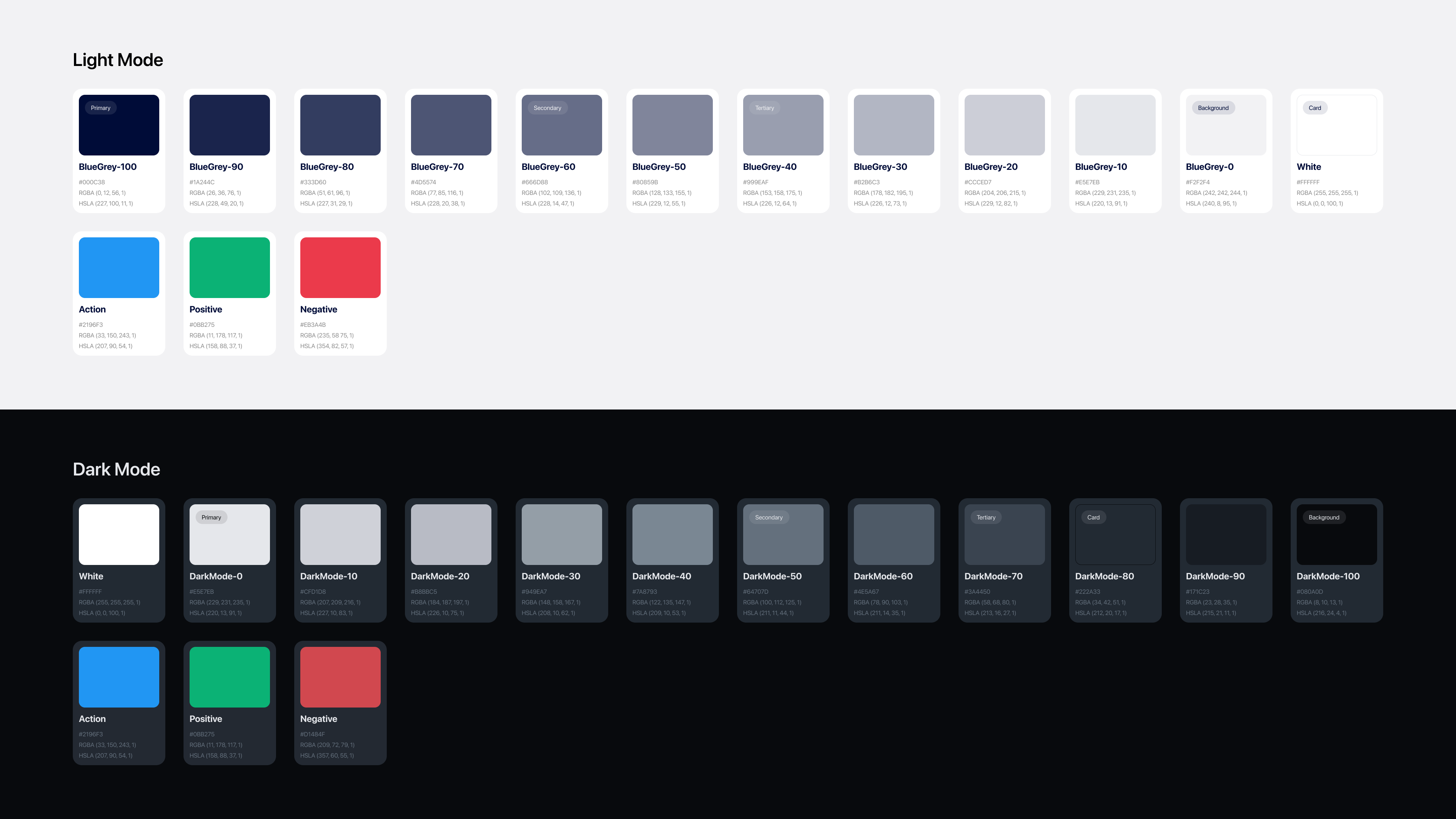
Color Palette / Dark Mode
From ideation to implementation took dark mode a couple months, as there were many one-off pages that required specific color changes.
One of our initial undertakings was to create a dark mode version of the existing style guidelines. We put together a palette with colors corresponding to our default color guide, and then made adjustments based on whether or not there was enough contrast between elements. Our Figma library was constantly being updated with instructions labeling when/where to use each color.
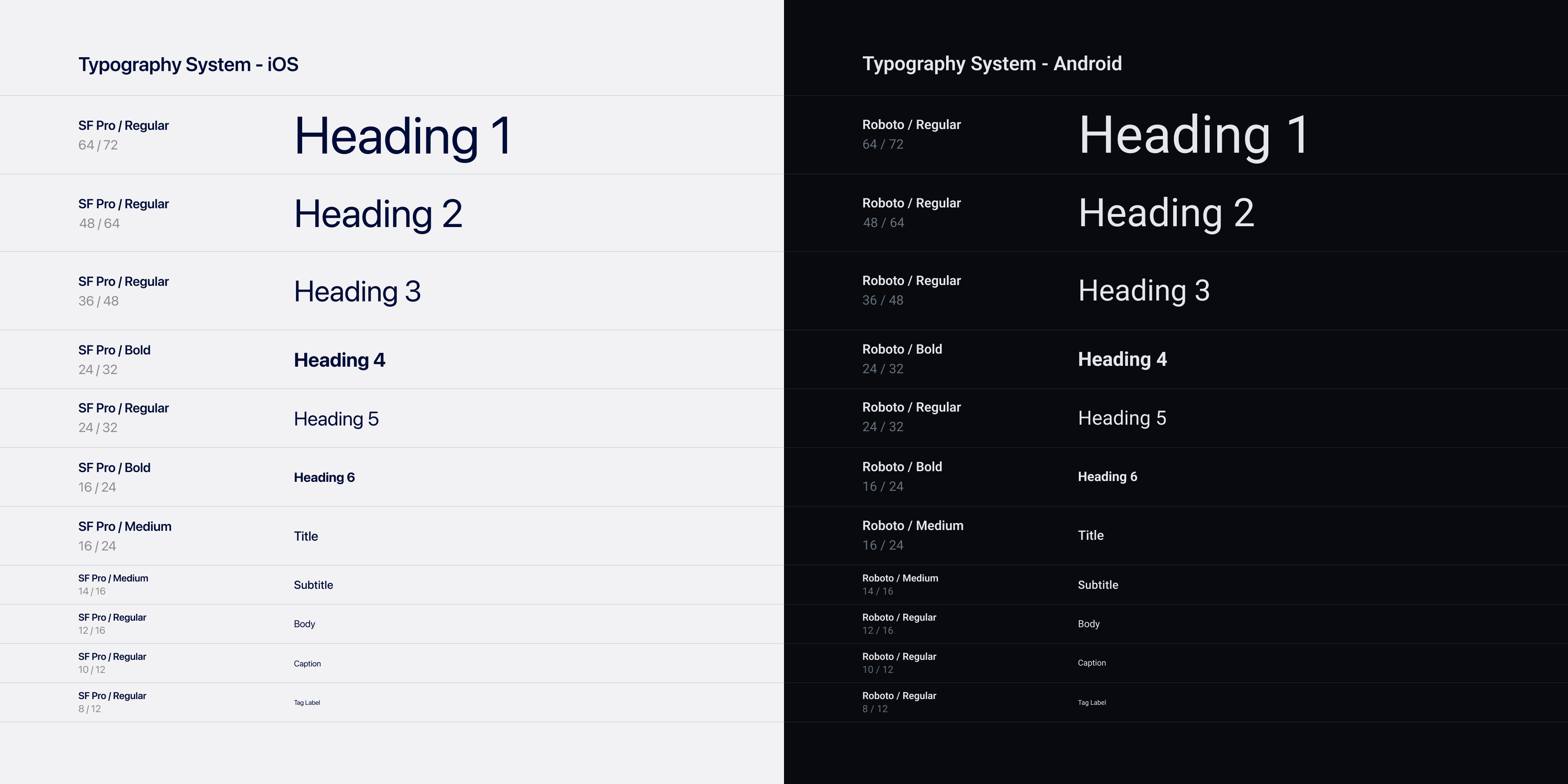
Typography System
One major update was setting line heights to follow our grid system, giving a cleaner look to pages with large amounts of copy.
Hound's typography system used the system fonts for each platform: SF Pro for iOS and Roboto for Android. We updated the system to follow a 4-point grid to maintain consistency across bodies of text. Our team also took a pass through the app to find instances of copy that didn't adhere to the guidelines, and made adjustments accordingly.
Component Library
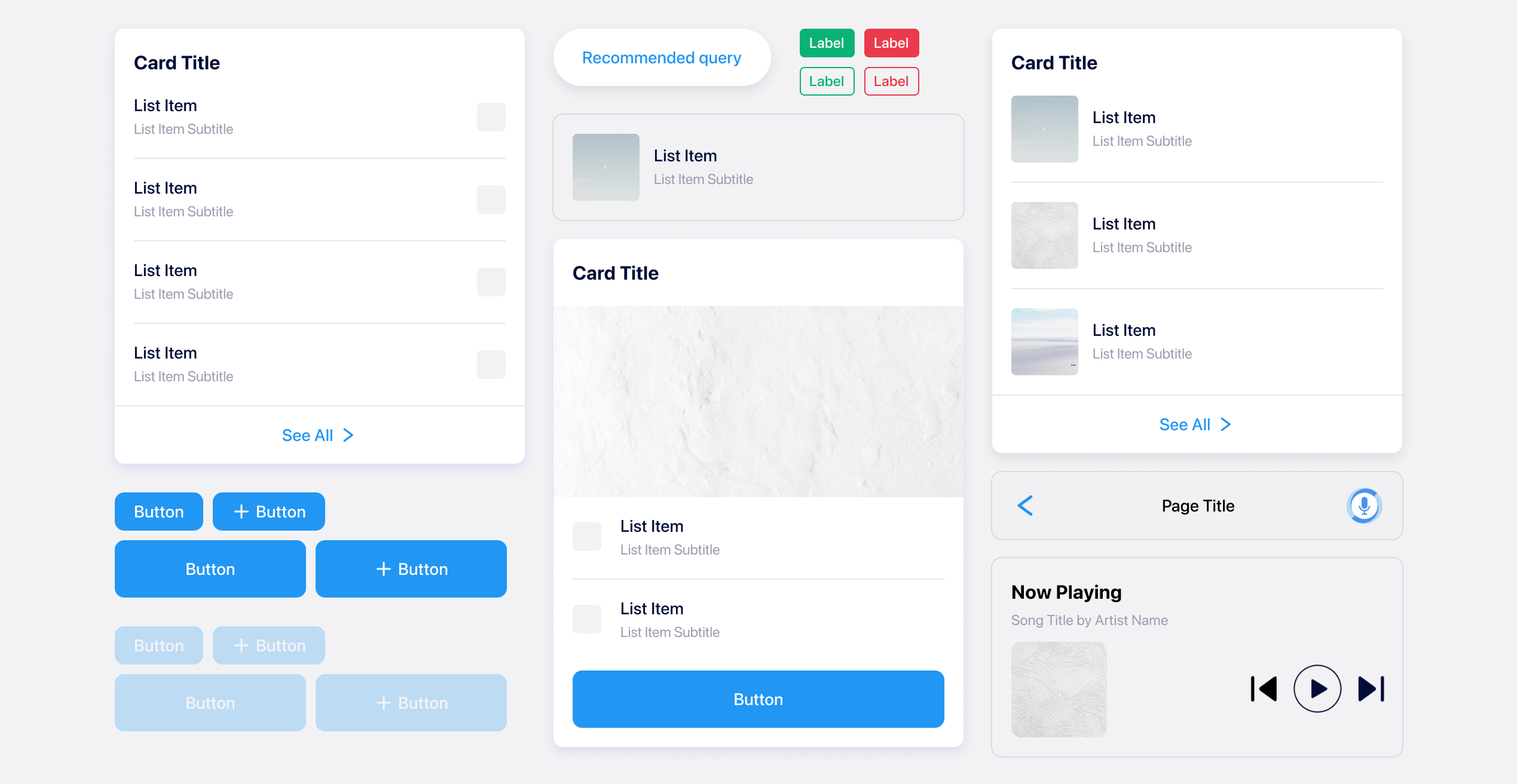
The above shows some of the most common components used in Hound. We had to make these flexible enough to fit a large percentage of use cases, while also not being too restrictive in case a query demands a super specific response.
A major task we took on was to take all the existing response cards (about 3-4 years worth of designs) and organize their similar aspects to expedite the design process when designing new ones. These included list items, buttons, media artwork, and internal links. We worked closely with engineering to record the assets we had used in the past, and added them to our library to avoid re-creating similar components.
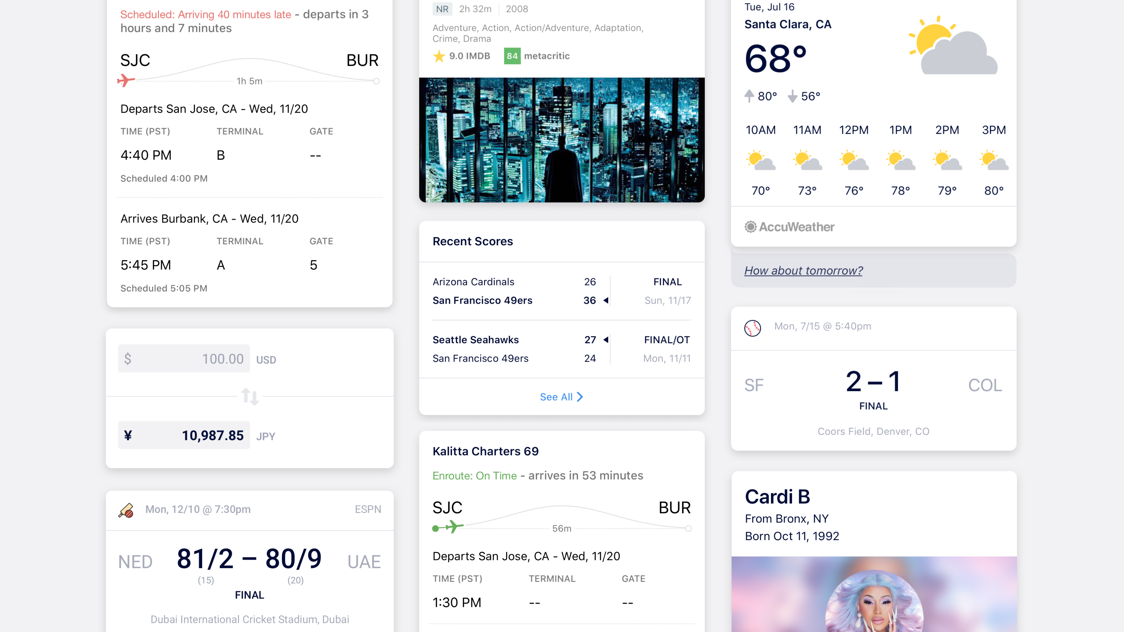
Response Cards
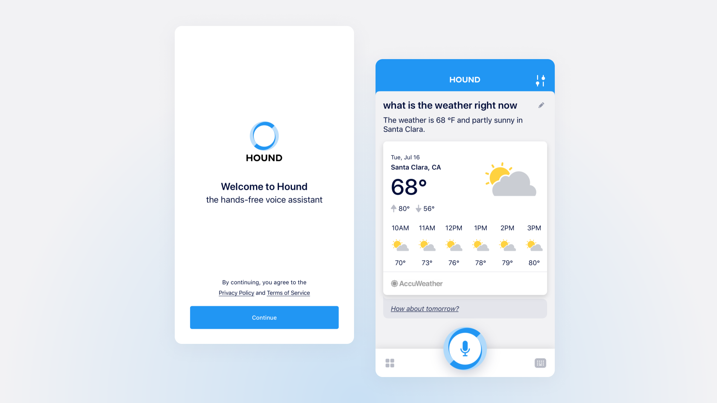
As a general-use app, Hound required cards ranging from sports scores to weather to audiobooks to food delivery. Finding similarities across each response was essential to creating a consistent visual look.
The vast majority of Hound's responses were accompanied with a card, specifically designed for each case. For Hound's design system, our team implemented a set of rules to keep consistency across each card design, such as organizing list components, using divider lines, and adding attribution labels when applicable, among others.
Closing Thoughts
Overall the component library and updated design system for Hound proved to be extremely beneficial for our workflow. Instead of spending time creating icons or figuring out list layouts, the flexibility in our components allowed for more plug-and-play designs. As the app was constantly adding new features and capabilities, our library continued to expand as well, so being able to easily re-use assets instead of creating them from scratch saved a significant chunk of time in our design process.