Midomi
Midomi is a website used for music identification and discovery. Tasked with updating the site to bring it more in-line with the SoundHound music app, I worked with a small development team to redesign the site's layout and make it responsive.
Goals
Midomi started off as a precursor to the SoundHound app, hosting similar music identification features. As the site hadn't been updated in several years, our goal was to revamp its visual layout and update it to fit the branding guidelines we had set for SoundHound. It essentially was to act as a web version of the more well-known app, complete with music identification, search features, and music info pages.
Timeline
This project took around two weeks from conception to design, and then around three weeks to a month for implementation. Due to the tight deadlines, we had incorporated some guidelines and assets from the Material Design library, saving time on both the design and development sides.
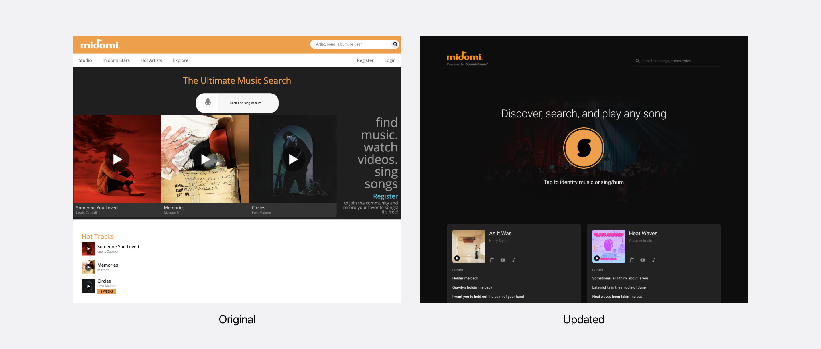
Before & After
The site had gone through a visual update around 2017, but never left its beta stage.
As part of the redesign, there were a few features in the original Midomi site that were to be deprecated, namely uploading song covers and user accounts. We wanted to bring more attention to the music identification feature, keeping it in line with the SoundHound app's central function.
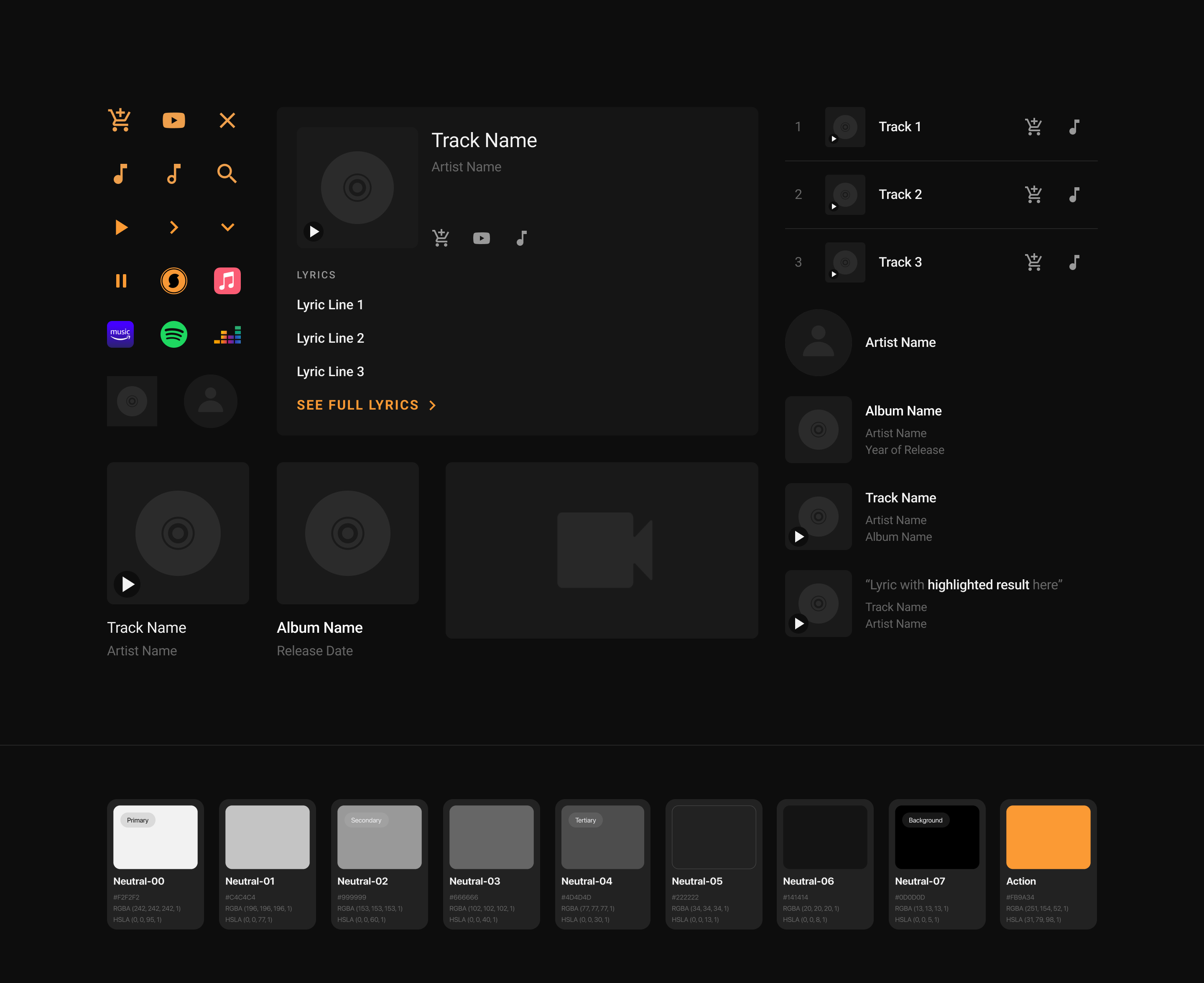
Style Guide
I worked closely with the development team on creating the components to be responsive and account for each edge case, such as excessively long strings or unexpected nulls when grabbing data.
To visually match Midomi with the SoundHound apxp's visual style, we followed the same color and typography guidelines used in the latter. Many of the components were created to be flexible and responsive for the designs to fit on mobile, tablet, and web screens.
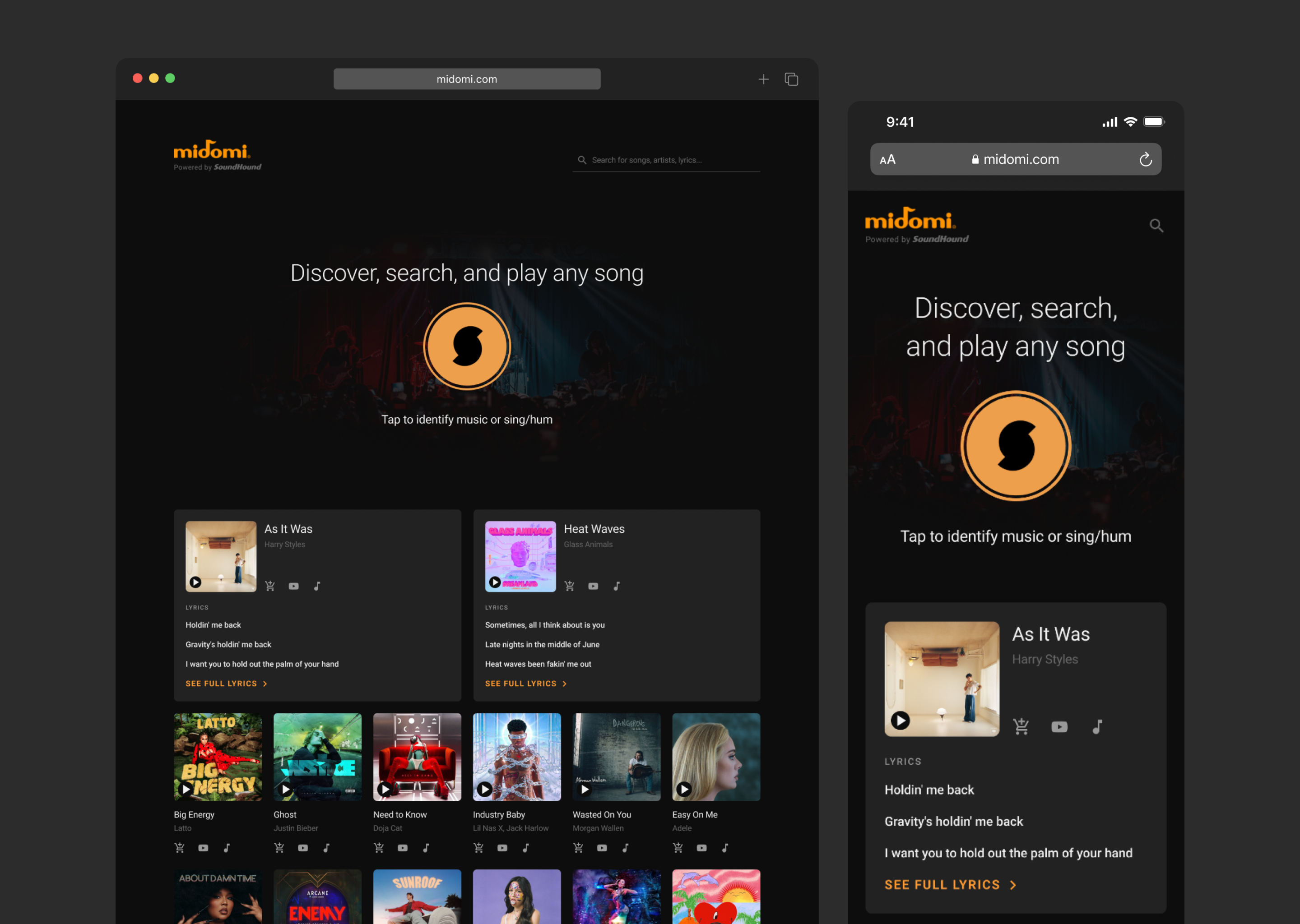
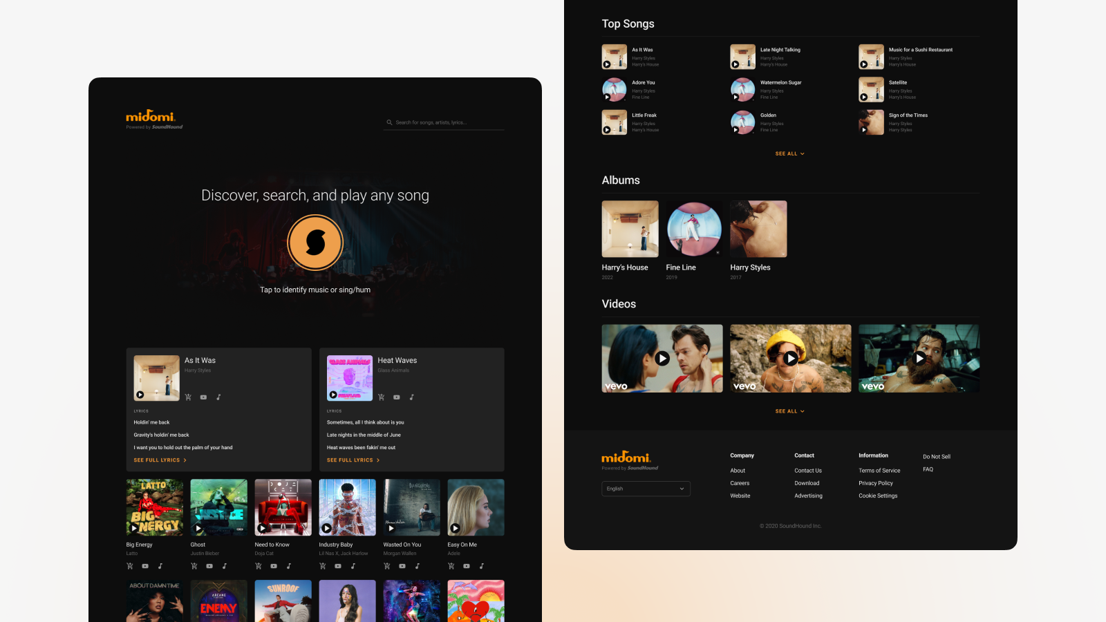
Homepage
We created our components and designed the layout following a 12-column grid, adjusting them as the screen size scaled down from web to mobile.
When designing the home page for Midomi, we wanted the music discovery button to be the first thing they notice. Above the fold, there are also the most recent “Top Songs,” which followed the same data source as in the SoundHound app.
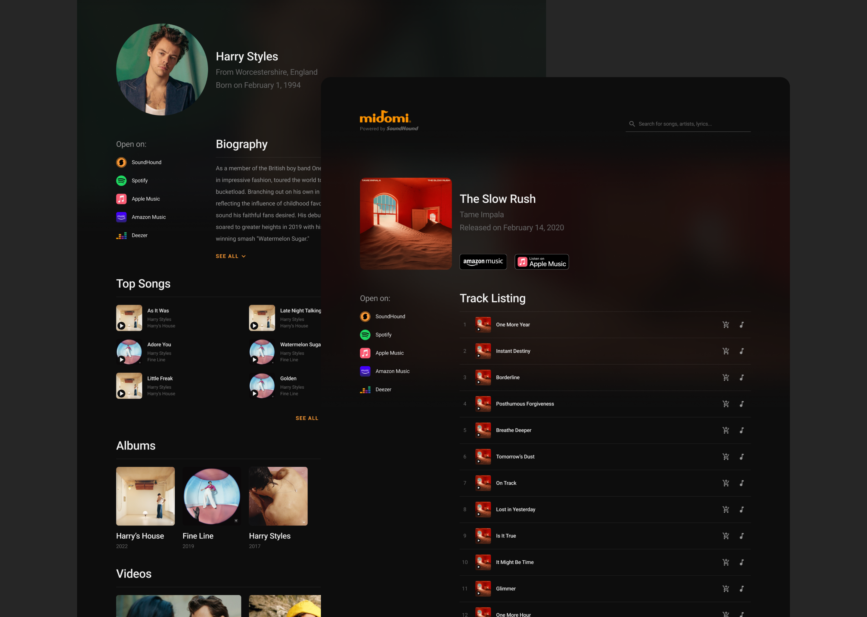
Artist & Album Pages
The pages for artists and albums followed similar formats as one another, allowing us to save a good amount of development time.
Each artist and album page consisted of a header providing supplementary info followed by sections that were suitable for the respective page types. We also provided links to both SoundHound and third-party apps in the event that the user was already part of a separate music streaming ecosystem.
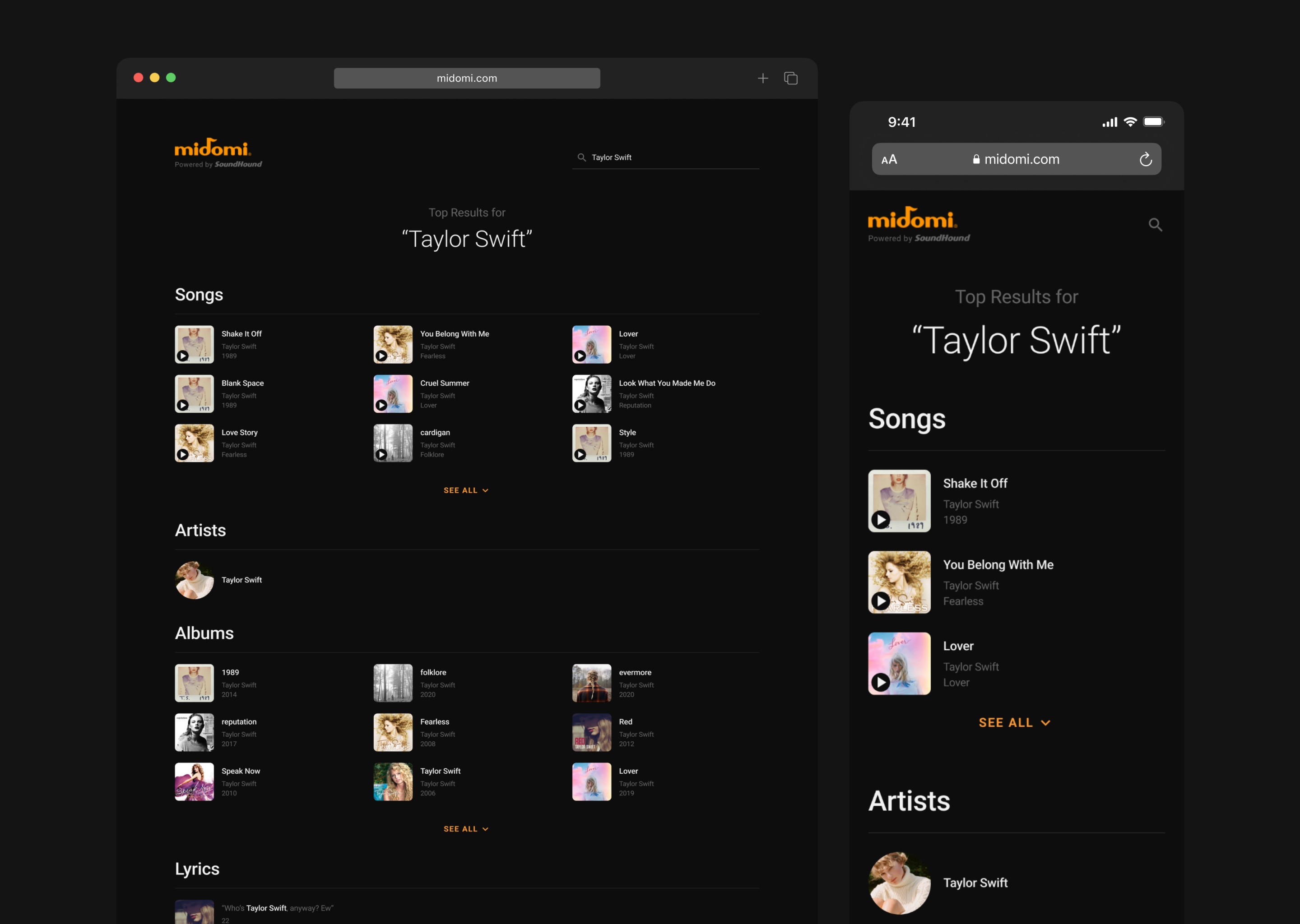
Search Results
We wanted to avoid overwhelming the user with results, opting to add a button to expand each section if the user wanted to dive deeper.
As our search data stemmed from the same source as in the SoundHound app, the results on Midomi followed a similar format: sections based on the song/track, artist, albums, and lyrics. For smaller devices, we lowered the number of columns in each section to prevent an over-abundance of unnecessary results.
Closing Thoughts
Despite the compressed timeline, the website update went smoothly considering our main goals of bringing the site more in line with the SoundHound music app. The page designs are relatively straightforward in terms of layout, but I believe there are opportunities to improve the site experience (namely the playback feature, which currently opens a picture-in-picture screen, and a history section to show songs recently identified by the user).